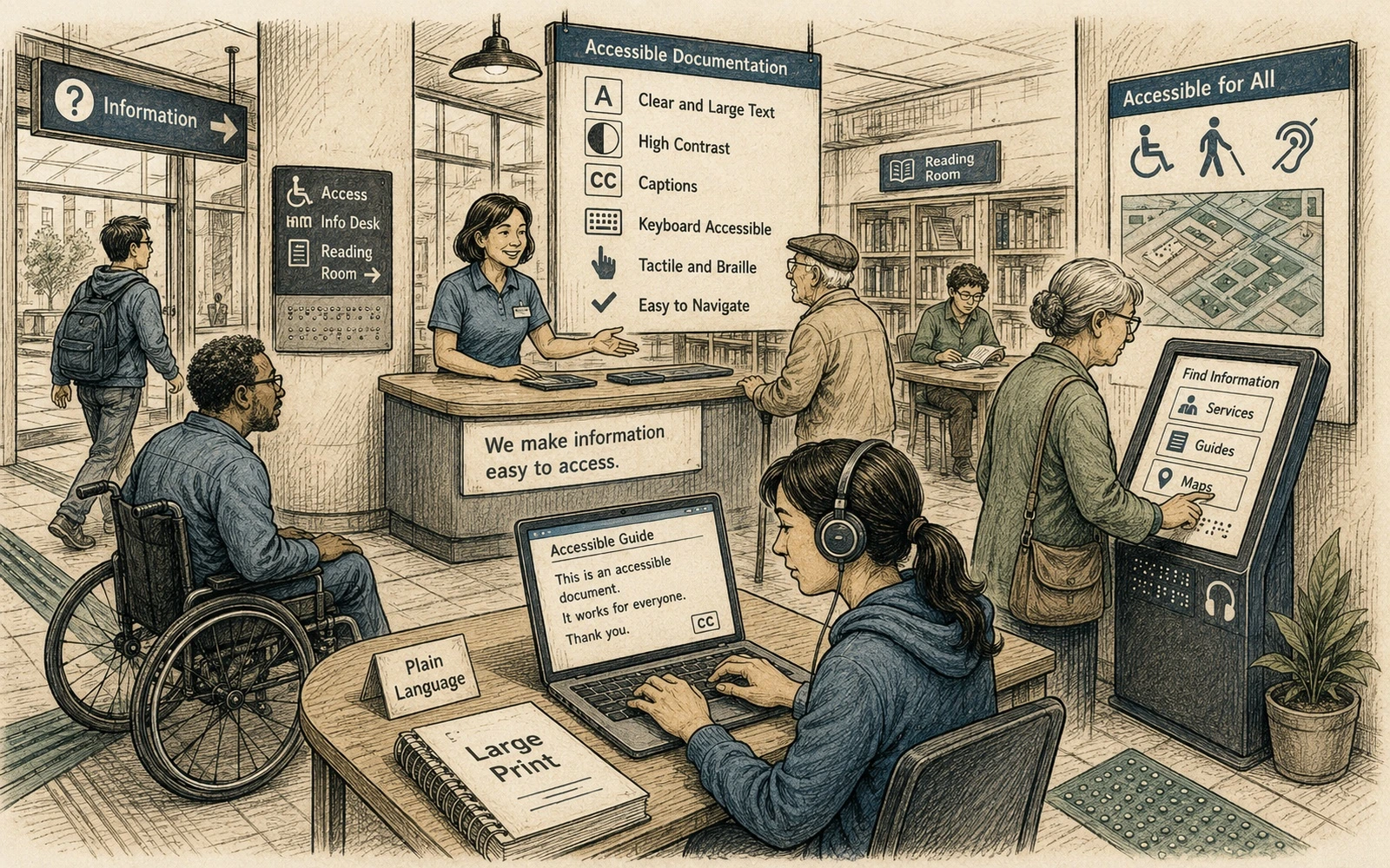
Accessibility starts in the source
A theme can provide good contrast and keyboard behavior, but authors still determine whether the content is understandable. Poor heading order, meaningless link text, screenshots without alternatives and tables used for layout cannot be repaired reliably by CSS.
Documentation teams therefore need accessibility rules in both templates and editorial review.
Make structure semantic
Use headings to describe hierarchy, not to obtain a font size. Keep lists as lists and tables for genuinely tabular relationships. Give pages descriptive titles and preserve a predictable order of information.
This helps screen-reader users, but it also improves search, navigation and content reuse.
Write links that make sense out of context
Avoid repeated “click here” links. The linked phrase should usually identify the destination or action. When several adjacent links have the same visible text but different targets, navigation becomes unnecessarily difficult.
Do not rely on color alone to communicate status or meaning.
Treat images as information
Alternative text should communicate what the reader needs from the image, not mechanically describe every pixel. Decorative images can have empty alt text. Screenshots used to teach a workflow need nearby text that explains the same essential action.
For complex diagrams, provide a concise alt plus a longer explanation in the surrounding content when necessary.
Test authoring patterns, not only pages
Add checks for missing alt text, skipped heading levels and empty links, but also manually test representative pages with keyboard navigation and accessibility tools. Include code samples, callouts, tab interfaces and search results in the test set.
Accessibility work scales when the safest patterns are the easiest patterns to author.
Applied example
Apply “WCAG 2.2 for documentation teams: the practical starting points” to one real page rather than discussing the rule in isolation. Choose a page with enough complexity to expose failure: headings, a table, a note, an example, a term that appears several times, and at least one action the reader must perform. Review the page once as an author and once as a reader who does not know the internal product vocabulary.
Record defects in observable terms:
- Which structure carries meaning that is not available in plain text?
- Which term changes meaning or spelling across the page?
- Which instruction depends on context that is never stated?
- Which rule would be difficult to check consistently in review?
A standard is useful when it helps two editors make roughly the same decision on the same content. If the rule sounds correct but cannot be demonstrated on a representative page, refine the rule, add an example, or narrow its scope before treating it as policy.
Quick editorial checklist
- Accessibility starts in the source. A theme can provide good contrast and keyboard behavior, but authors still determine whether the content is understandable.
- Make structure semantic. Use headings to describe hierarchy, not to obtain a font size.
- Write links that make sense out of context. Avoid repeated “click here” links.
- Treat images as information. Alternative text should communicate what the reader needs from the image, not mechanically describe every pixel.