Growth changes the problem
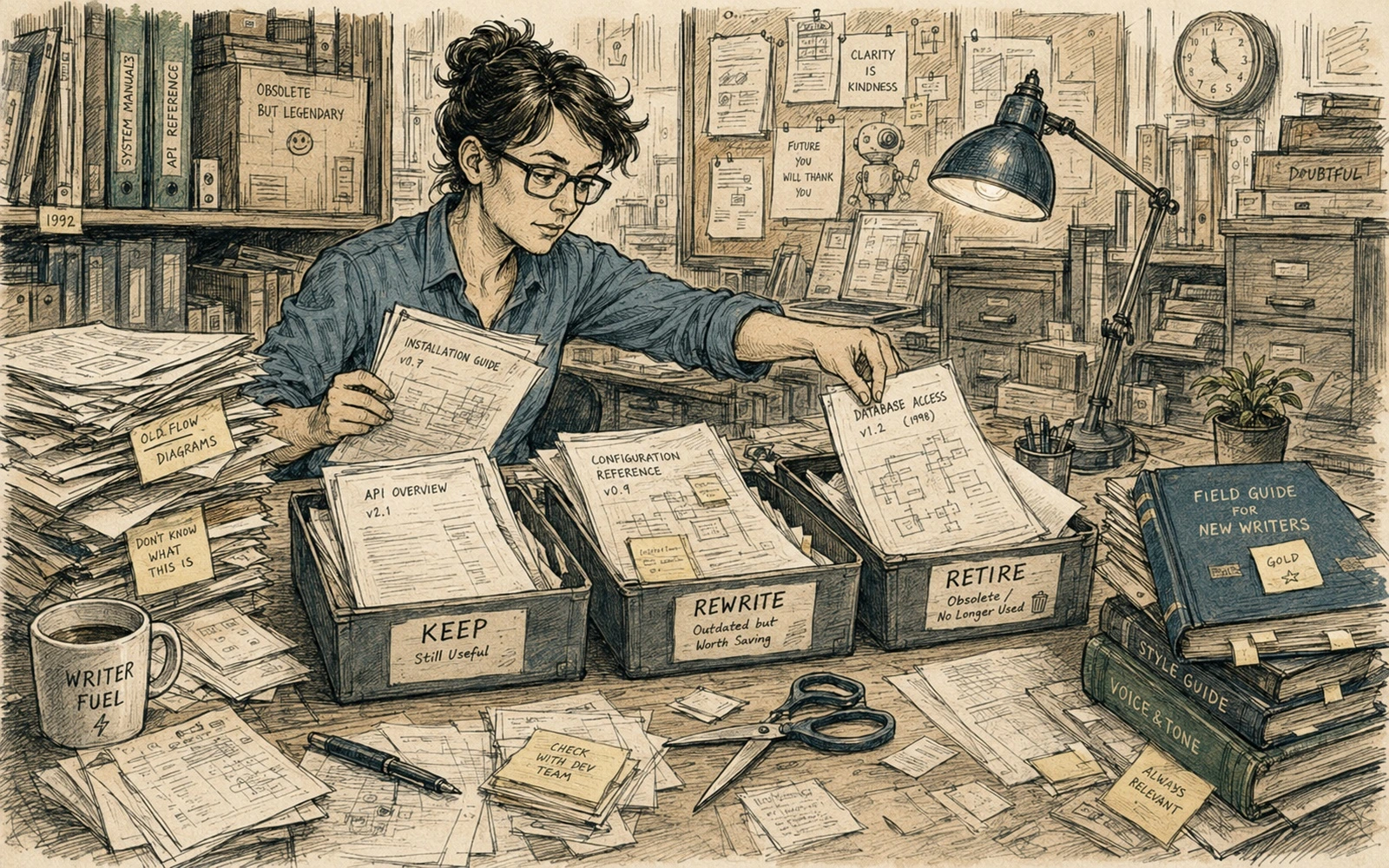
Small documentation sets can survive almost any navigation scheme. When there are twenty pages, readers can scan a menu, writers remember where everything lives, and duplicate explanations are still visible. At five hundred pages those advantages disappear. The structure becomes a product feature in its own right.
The first rule is to stop treating the folder tree as information architecture. Repository layout is for maintainers; navigation is for readers. They may coincide, but they solve different problems.
Start with user intents and content types
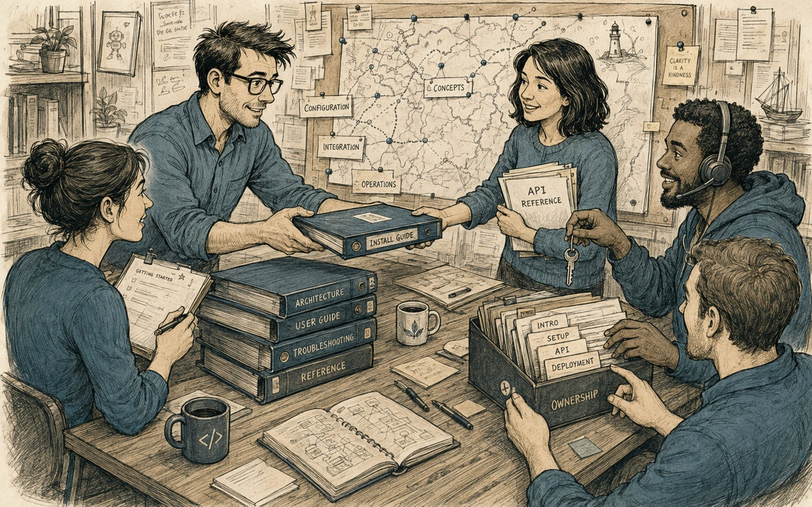
List the recurring reasons people open the documentation: learn a concept, complete a task, look up a field, troubleshoot a failure, understand a release change. Then define a small set of content types that serve those intents. A tutorial, how-to guide, reference page and conceptual explanation should not all pretend to be the same article.
A content model gives each type predictable metadata and structure. That consistency matters more as the archive grows because it enables filters, search facets, automated checks and reusable layouts.
Keep the top level boring
The global navigation should change slowly. Do not create a top-level item every time a product team, framework or trend becomes important. Put volatile detail lower in the hierarchy and expose it through tags, collections and search.
A useful test is simple: if a category is likely to disappear during the next reorganization, it probably does not belong in the permanent navigation.
Design for cross-links, not only trees
Readers rarely move through documentation like a textbook. They arrive from search, issue trackers, code, support answers and old bookmarks. Every page therefore needs enough context to stand on its own and useful links to the next likely action.
Use related-content blocks deliberately. Link from concepts to tasks, from tasks to reference, and from errors to recovery instructions. Avoid giant “see also” lists that merely expose the taxonomy.
Audit the structure before it hurts
Track orphan pages, duplicate titles, broken links, sections with hundreds of children and tags that mean the same thing. Review search queries that return weak results. Once a quarter, inspect the navigation as if you were a new reader.
Information architecture is not a one-time diagram. It is maintenance work. The goal is a system that can absorb the next five hundred pages without making the first five hundred harder to find.
Applied example
To make the ideas in “Information architecture for documentation that keeps growing” operational, take one piece of documentation that is actually changing this week: a procedure, release page, onboarding step, troubleshooting article or ownership record. Make a working copy and write down four things before editing it: who uses it, what event makes it change, who can verify the facts, and what the reader should be able to do when finished. That small inventory exposes hidden assumptions faster than a general “improve the docs” task.
Run one realistic change through the workflow from start to finish. Do not redesign the whole system. Change one fact, one step or one responsibility and observe where the process slows down or loses information. A useful review asks:
- Can the reader identify the expected outcome without asking the author?
- Is there a clear owner for the next update?
- Can a reviewer verify the changed fact from the product or process itself?
- Does the page still make sense if an old screenshot, note or workaround is removed?
The point is to test the method under a real maintenance event. Documentation practices become trustworthy when they survive change, not when they look tidy in a static example.
Quick editorial checklist
- Growth changes the problem. Small documentation sets can survive almost any navigation scheme.
- Start with user intents and content types. List the recurring reasons people open the documentation: learn a concept, complete a task, look up a field, troubleshoot a failure, understand a release change.
- Keep the top level boring. The global navigation should change slowly.
- Design for cross-links, not only trees. Readers rarely move through documentation like a textbook.