Define the problem
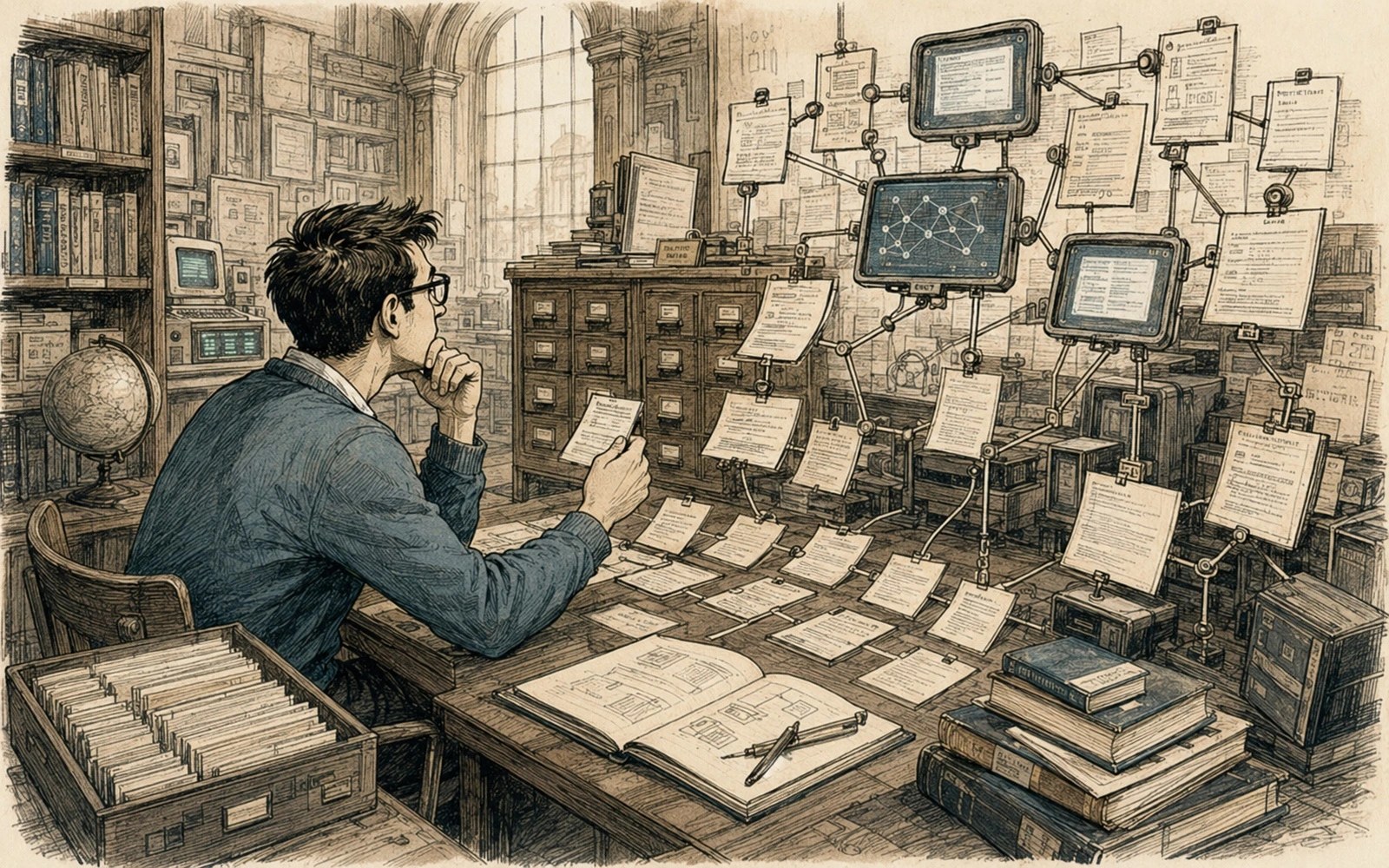
Hypertext gave readers freedom from a linear manual and immediately created orientation problems. Early hypertext systems proved that technical information did not need to be read front to back, but they also exposed the cost of weak link structure.
Choose a useful model
Chunking became an editorial decision: fragments must be reusable without becoming too small to understand. Authors had to decide which concepts deserved standalone nodes and how much context a reader needed after arriving through an unexpected path.
Build the workflow
Descriptive link text became interface copy and information scent, not just decoration around a URL. Navigation trees, indexes and cross-references became part of the writing problem rather than decoration added after the text was complete.
Check the result
Navigation must reveal parent concepts, sibling tasks, next steps and ways back; connected pages are not automatically usable architecture. Modern portals add search, analytics and responsive UI, but they still fail when every page assumes the reader entered through the table of contents.
Keep it maintainable
Modern frameworks changed the interface but not the cognitive problem of moving through fragmented knowledge. The durable lesson is to write pages as connected, self-orienting units: each one needs scope, context and a clear next decision.
Applied example
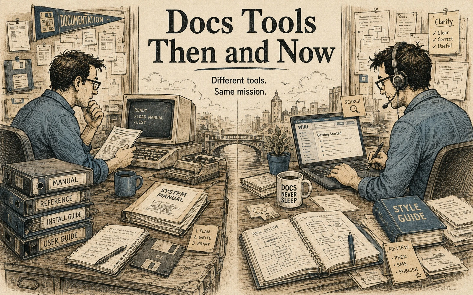
Read “Hypertext before modern documentation portals” in two columns: what belonged to the technology of its time, and what belonged to the underlying documentation problem. Recreate one small historical workflow with current tools—for example, publishing a release note, maintaining a glossary or packaging an offline manual—and mark which decisions stayed the same even though the medium changed.
Look for durable patterns rather than nostalgia:
- How did readers find information?
- How were corrections distributed?
- Who owned accuracy after publication?
- Which limitations of the old medium forced useful discipline?
Historical material becomes valuable when it helps us see a current problem more clearly. The goal is not to restore an old workflow, but to separate enduring editorial principles from tools that happened to be available at the time.
Quick editorial checklist
- Define the problem. Hypertext gave readers freedom from a linear manual and immediately created orientation problems.
- Choose a useful model. Chunking became an editorial decision: fragments must be reusable without becoming too small to understand.
- Build the workflow. Descriptive link text became interface copy and information scent, not just decoration around a URL.
- Check the result. Navigation must reveal parent concepts, sibling tasks, next steps and ways back; connected pages are not automatically usable architecture.